For our teaser trailer we need institutions that are experienced in our genre so i have looked at some that have been used by other horror/slasher/psychological movies:
The Strangers- Rogue Pictures
My Bloody Valentine- Lionsgate
The Descent- Lionsgate
The Texas Chainsaw Massacre- New Line Cinema
Don't be afraid of the dark- Miramax
Halloween- Dimension Films, Metro Goldwyn Mayer
Friday The 13th- New Line Cinema, Paramount
Wolf Creek- Dimension Films
Rogue pictures would seem to be suitable because the institution image well reflects our teaser trailer and Miramax as it has worked on large scale movies

Chloe Hagger 5064, Henry Barratt-Taylor 4097, Katherine Maximchuk 5090
Tuesday, 7 December 2010
Monday, 29 November 2010
Website building

I have chosen Wix to make my first prototype with which has proven successful. I have embedded a video of 'the strangers' to give an idea of what it will look like when I have put our own trailer on the website. I have used the same font throughout to give the film a branding and have chosen the colour scheme black white and red being the conventional horror colours.
this is the finished prototype.
Thursday, 25 November 2010
Villain Costume Ideas
We wanted the villain in our trailer to look particularly menacing and so we researched several different horror films and observed the costumes and mannerisms of the villains. It became obvious very early on that we would need to cast our villain as someone of not only a tall build, but a slightly bulky one too so as to increase the characters presence on-screen. Here are some short analyses of villains from horror/slasher films we looked at:
Halloween (2007) – Michael Myers wears a dark coloured and very tatty body suit with boots and an expressionless mask which is particularly unnerving. His weapon is a knife.

Friday the 13th (2009) – Jason Voorhees wears similarly tatty clothes to Michael – a baggy and battered jacket adding extra mass to his appearance and a dark torn jumper underneath. He dons a hockey mask to hide his face. His weapon is a machete.

The Texas Chainsaw Massacre (1974) – Interestingly enough, Leatherface’s costume is not a particularly menacing or suspicious one. He wears a shabby black suit and tie with a white shirt, with a disturbing mask made out of human flesh which gives him a brutally insane edge. Without need to say it, his weapon is a chainsaw.

My Bloody Valentine (2009) – Harry Warden wears a dirty, dark coloured mining suit with boots and gloves so that not a single part of humanity is evident. He wears a mining hat with a light on and a menacing gas mask with it. His weapon is a pickaxe.

After analysing each of these characters we decided to take different aspects of them to create our villain for our trailer. We gave him a white t-shirt in order to symbolise that he was once an ordinary, sane person and to offset the audience's expectations and give them some slight hope that at some point in the film he may display sanity. We gave him a dilapidated grey jacket and a semi-opaque plastic mask with a strangely unpleasant face on it which we do not make very visible in the trailer. Our weapon of choice was an axe, as we thought that it was particularly menacing and suited the mood of our trailer.

Monday, 15 November 2010
Typography for our title


We have decided to have our title in the style of a typewriter font, because that is the font that was used to record documents at the asylum. The old style creates a sense of realism and also makes the viewer think of data, which takes away any human feeling to it and therefore makes the viewer feel uneasy.
Wednesday, 10 November 2010
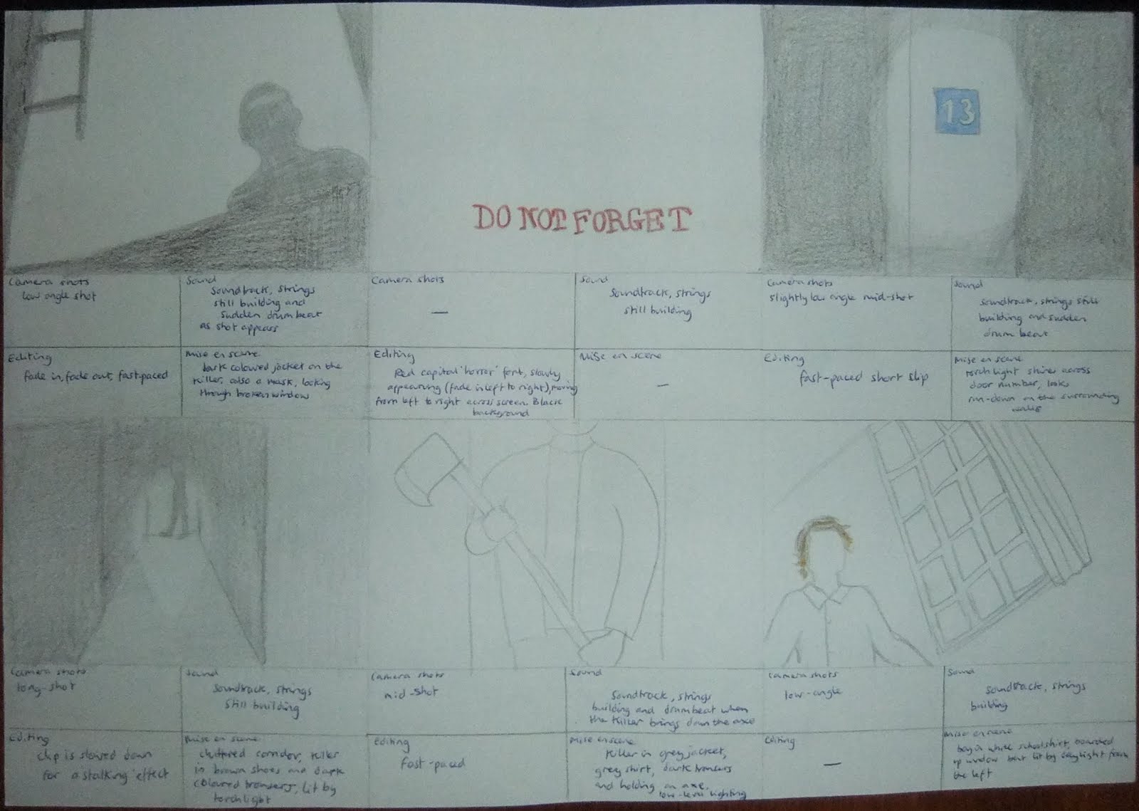
Storyboard
We have drawn out a storyboard after visiting our location to guide us with our camera shots when we next visit to film, we took into consideration our genre research and questionnaire results, as well as our own ideas to create an original plot, for example we have gone against conventions of horror by having only male victims:


Thursday, 4 November 2010
West Park Asylum Shots
After seeing impressive photos of West Park Asylum on http://www.28dayslater.co.uk/forums/tags.php?tag=epsom, an urban exploration website, we decided to visit the location to see if it is an ideal filming location for our teaser trailer. We think so, it is clearly derelict and fits our horror genre for an eerie abandoned location, as you can see from the photos we took:


Tuesday, 19 October 2010
Mise en scene for the boys
Here are some of the costumes characters wear in other typical horror films:
Friday the 13th


 The Strangers

 Tormented


Friday the 13th

My Bloody Valentine
Return to House on Haunted Hill


One factor that links all of this mise en scene is that no clothing stands out, no bright colours are used and no character is dressed out of the ordinary. For example, in Tormented the characters are school students and so are in uniform. This means that we want all of our victims dressed in the same type of 'normal' clothing, no one should stand out. We have decided to dress them all in school uniform; a plain white shirt, blazer, matching colour trousers and plain shoes. This will ensure that no one stands out and show that they are school boys so we do not need to waste time with any other way to show this in our teaser trailer.


Monday, 18 October 2010
Location
Unfortunately we have had complications in choosing our location for our teaser trailer. Now that major scaffolding has been erected on the house that we were planning on using we have had to search elsewhere, and one particular place has caught our eyes - West Park Mental Hospital. It is situated in Epsom, and it is brilliantly gloomy (we hope it is not being demolished but are yet to confirm this.) Here are some images of the place:


Friday, 15 October 2010

Here the words have been used to create an image, with the help of a couple of horns and a tail, of what appears to resemble the Devil. This is highlighted by the fact that only the words ‘the Devil’ are in red, as are the horns and the tail.

Again the title creates an image that reflects the title ’27 Dresses’ and it intertwines with the image of the actress. Although it the image includes written information about the film that people tend not to pay much attention to, the title is made clear through its pink font.

The style of the title for the film ‘Blindness’ embodies the witty satirical image of an eye test chart and the caption underneath includes the word ‘vision’ as a pun on the title.

Although the font is not particularly original or inspiring, the fact that the reflections show what seem to be silhouettes gives a mysterious aura to the poster.

The font of the title for ‘West Side Story’ looks almost mechanical and rusty, with the gaps and distortion in the letters and the images of the staircases and people, the impression is given that the title appears almost as a building.

Although this is not a particularly good example of typography, the background is very relevant to the film. What with the gritty appearance of the poster - the holes torn in it and the worn appearance of the chequered pattern and font, the viewer expects something more than what the title gives away.
Thursday, 7 October 2010
Death masks
An idea on a style of mask we can use for the killer- a death mask. This is a cast taken from the face of a dead person, and encaptures the expression on the face when they died


These are eerie and frightening, from a victims point of view seeing the face of death on their killer would be frightening, as they know they are about to die. Plaster casts are made to use these so we will have to experiment.
Subscribe to:
Posts (Atom)