Showing posts with label Research. Show all posts

Monday, 25 April 2011

How did you use new media technologies in the construction and research, planning and evaluation stages?

Internet
The internet was almost an essential tool in helping us to create and plan for our production piece in the sense that it allowed us to carry out a vast amount of research from different sources in order to learn about our genre and how to create an effective trailer. Without it, it would have been much harder for us to analyse and learn from teaser trailers for films posted online on YouTube and other such sites and it would have been much harder to create and send out surveys so as to obtain information of not only maximum quantity but of quality also. We used the internet in order to find our location for filming, which would not have been otherwise possible due to the fact that we found it via an online forum specifically focused on abandoned buildings in Britain called http://www.abandoned-britain.com/ . The internet was also incredibly crucial in helping us to find an appropriate font for our poster, as after searching across different sites we were able to pick from a variety of fonts until we found one that fitted perfectly with our trailer from http://www.dafont.com/ . 
Poster
When constructing the poster for our trailer we used more than one program in order to perfect it and achieve the best possible outcome. Although we were familiar with the program Photoshop there was still a lot that we did not know about it and so we were eager to experiment with it and learn more about the program. The base of our poster was a simple photo of the back of our villain with a spotlight trained on him, highlighting his shadow against a peeling wall. However it did not look particularly eerie until we started to experiment with it on Photoshop by editing the contrast and lighting, which enabled us to create a much more professional effect. The internet was a great use within this as well as we were able to download a particular brush that allowed us to make the title on the poster to look smudged and dirty – an effect that greatly contributed to the dark atmosphere we wanted to achieve. It was not as easy to adjust the colour of the image on Photoshop without distorting and blurring it so we chose to experiment on PaintShop Pro – a program with which none of us were familiar with. We chose to buy a book on the program which enabled us to get to grips with the software and after adjusting the colour on PaintShop Pro the image looked slightly better.
Video Camera
As we had to use a particular video camera to film our entire teaser trailer we found it necessary to capture experimental shots in different situations so as to test its capabilities. We decided to film short clips in different lighting conditions and found that it was not particularly efficient in darker conditions, which in turn alerted us to the fact that if we were to film successfully within a dark setting (which we would be doing) we would have to equip ourselves with an adequate amount of torches. We also used the video camera to record sound clips that we hoped we could use within our teaser trailer, for example, we went into a wood and sat down with the camera on in order to capture some animal sounds, and although we only managed to capture bird song it was a worthwhile trip as we recorded the sound of running footsteps which we planned to use within our trailer, and later that evening we tried to record foxes screeching but found that the sound quality was not good enough to use. Another piece of sound that we used from recording through the camera was the cawing of crows which we used at the beginning of our trailer. We also used the camera to experiment with different types of camera shots around our filming location, including establishing shots of the area and close-ups which helped us to decide which angles would be most effective in creating suspense within our trailer.
iMovie
iMovie was one piece of software that we would have struggled without. Although it was not particularly easy to use at first as we were accustomed to using the older version with our coursework last year, it allowed us to be more creative and adventurous within our work. This was particularly so as this year’s work was a teaser trailer as opposed to last year’s being a normal trailer and so there was a sufficient amount more work required in order to create a presentable piece of work, and as our teaser trailer’s genre is horror we found that much more snappy editing was required. The ability to control the speed of each of our shots was something that we were able to utilise and we decided to use it within our trailer at the very beginning in order to slow down an establishing shot in order to create suspense.
Garage Band / Ableton
Sound was a very important factor within our production piece as it was essential to create suspense for a horror teaser trailer. We originally wanted to create our own soundtrack from scratch, and so we downloaded some ‘horror’ sound effects from soundbible.com and started experimenting. After some practise with the different synths and effects within Ableton we decided that the process of creating a sound track from nothing would be too lengthy a process and so we searched online for eerie songs and soundtracks. After finding an appropriate track we decided that we wanted to add our own touch to it and so placed it in Garage Band and cut it apart and layered it until it sounded satisfactory, making sure that it fitted well and in time with the trailer and we then added sound effects that we recorded from the video camera.


Wix


To create our website we used the online website builder, Wix. this proved very successful as it allowed us to create a simple and effective website to promote our trailer. We used the same font that we had used for the trailer and poster which was downloaded from dafont.com and gave it a blood red colour to contrast the black and white background of the abandoned asylum. We were able to embed the video from http://www.youtube.com/ and ensure that it played as soon as the site was loaded, making it easier to access for users. 

Monday, 15 November 2010

Typography for our title


We have decided to have our title in the style of a typewriter font, because that is the font that was used to record documents at the asylum. The old style creates a sense of realism and also makes the viewer think of data, which takes away any human feeling to it and therefore makes the viewer feel uneasy.

Wednesday, 10 November 2010

Storyboard


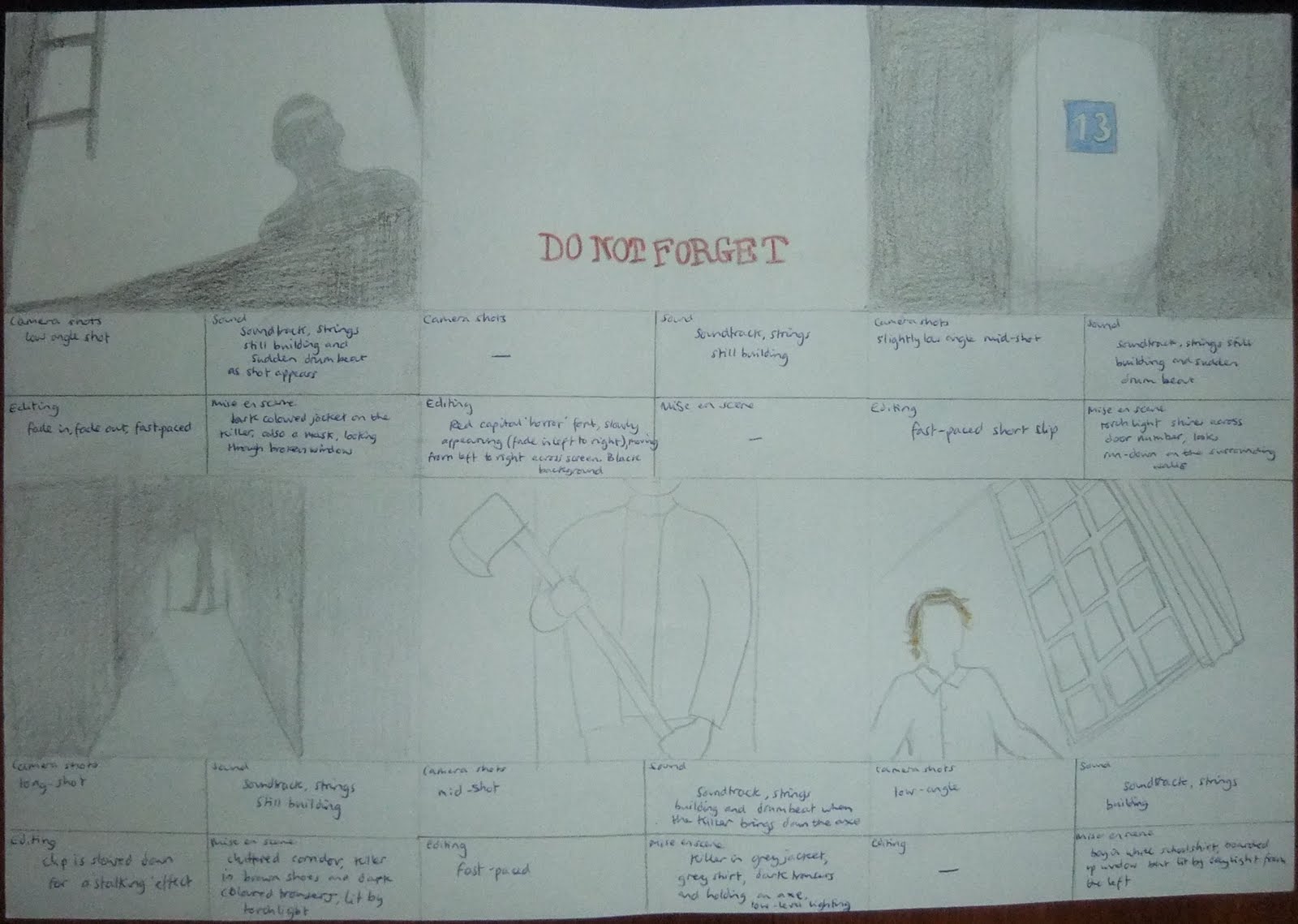
We have drawn out a storyboard after visiting our location to guide us with our camera shots when we next visit to film, we took into consideration our genre research and questionnaire results, as well as our own ideas to create an original plot, for example we have gone against conventions of horror by having only male victims:

Thursday, 4 November 2010

West Park Asylum Shots

After seeing impressive photos of West Park Asylum on http://www.28dayslater.co.uk/forums/tags.php?tag=epsom, an urban exploration website, we decided to visit the location to see if it is an ideal filming location for our teaser trailer. We think so, it is clearly derelict and fits our horror genre for an eerie abandoned location, as you can see from the photos we took:


Tuesday, 19 October 2010

Mise en scene for the boys

Here are some of the costumes characters wear in other typical horror films:
Friday the 13th
My Bloody Valentine
 Return to House on Haunted Hill
 The Strangers

 Tormented


One factor that links all of this mise en scene is that no clothing stands out, no bright colours are used and no character is dressed out of the ordinary. For example, in Tormented the characters are school students and so are in uniform. This means that we want all of our victims dressed in the same type of 'normal' clothing, no one should stand out. We have decided to dress them all in school uniform; a plain white shirt, blazer, matching colour trousers and plain shoes. This will ensure that no one stands out and show that they are school boys so we do not need to waste time with any other way to show this in our teaser trailer.

Location (continued)

Another possibility for our location is Hellingly Asylum:


Monday, 18 October 2010

Location

Unfortunately we have had complications in choosing our location for our teaser trailer. Now that major scaffolding has been erected on the house that we were planning on using we have had to search elsewhere, and one particular place has caught our eyes - West Park Mental Hospital. It is situated in Epsom, and it is brilliantly gloomy (we hope it is not being demolished but are yet to confirm this.) Here are some images of the place:


Friday, 15 October 2010


Here the words have been used to create an image, with the help of a couple of horns and a tail, of what appears to resemble the Devil. This is highlighted by the fact that only the words ‘the Devil’ are in red, as are the horns and the tail.


Again the title creates an image that reflects the title ’27 Dresses’ and it intertwines with the image of the actress. Although it the image includes written information about the film that people tend not to pay much attention to, the title is made clear through its pink font.


The style of the title for the film ‘Blindness’  embodies the witty satirical image of an eye test chart and the caption underneath includes the word ‘vision’ as a pun on the title.


Although the font is not particularly original or inspiring, the fact that the reflections show what seem to be silhouettes gives a mysterious aura to the poster. 


The font of the title for ‘West Side Story’ looks almost mechanical and rusty, with the gaps and distortion in the letters and the images of the staircases and people, the impression is given that the title appears almost as a building.


Although this is not a particularly good example of typography, the background is very relevant to the film. What with the gritty appearance of the poster - the holes torn in it and the worn appearance of the chequered pattern and font, the viewer expects something more than what the title gives away.

Thursday, 7 October 2010

Death masks


An idea on a style of mask we can use for the killer- a death mask. This is a cast taken from the face of a dead person, and encaptures the expression on the face when they died  

These are eerie and frightening, from a victims point of view seeing the face of death on their killer would be frightening, as they know they are about to die. Plaster casts are made to use these so we will have to experiment. 

Gorezone


This magazine is perfect for our trailer as it is specialist to horror films and has covered films that relate to ours such as “Friday the 13th” and “Nightmare on Elm Street”. The magazine uses a block red font, as red is conventional of horror and has the killer on the front drawing the attention straight to the film as it is the main focus. On the ‘Friday the 13th’ cover Gorezone expects the viewer to know the film, as it does not say the title of the film, showing how this magazine is directed at a niche audience. The magazine has also used contrasting colours of white and red and black and red to give a modern take on horror and shows that simplicity is more effective than loads of different colours. The picture of the characters cut through the title which gives the impression that it is a well established magazine although it only focuses on a smaller audience than other film magazines.