We wanted the villain in our trailer to look particularly menacing and so we researched several different horror films and observed the costumes and mannerisms of the villains. It became obvious very early on that we would need to cast our villain as someone of not only a tall build, but a slightly bulky one too so as to increase the characters presence on-screen. Here are some short analyses of villains from horror/slasher films we looked at:
Halloween (2007) – Michael Myers wears a dark coloured and very tatty body suit with boots and an expressionless mask which is particularly unnerving. His weapon is a knife.
Friday the 13th (2009) – Jason Voorhees wears similarly tatty clothes to Michael – a baggy and battered jacket adding extra mass to his appearance and a dark torn jumper underneath. He dons a hockey mask to hide his face. His weapon is a machete.
The Texas Chainsaw Massacre (1974) – Interestingly enough, Leatherface’s costume is not a particularly menacing or suspicious one. He wears a shabby black suit and tie with a white shirt, with a disturbing mask made out of human flesh which gives him a brutally insane edge. Without need to say it, his weapon is a chainsaw.
My Bloody Valentine (2009) – Harry Warden wears a dirty, dark coloured mining suit with boots and gloves so that not a single part of humanity is evident. He wears a mining hat with a light on and a menacing gas mask with it. His weapon is a pickaxe.
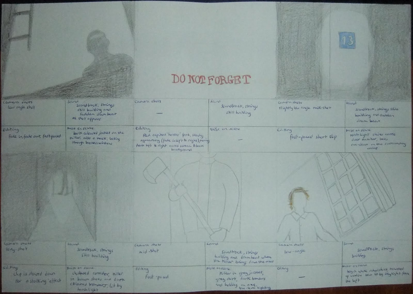
After analysing each of these characters we decided to take different aspects of them to create our villain for our trailer. We gave him a white t-shirt in order to symbolise that he was once an ordinary, sane person and to offset the audience's expectations and give them some slight hope that at some point in the film he may display sanity. We gave him a dilapidated grey jacket and a semi-opaque plastic mask with a strangely unpleasant face on it which we do not make very visible in the trailer. Our weapon of choice was an axe, as we thought that it was particularly menacing and suited the mood of our trailer.