
Chloe Hagger 5064, Henry Barratt-Taylor 4097, Katherine Maximchuk 5090
Monday, 25 April 2011

How did you use new media technologies in the construction and research, planning and evaluation stages?
Internet
 The internet was almost an essential tool in helping us to create and plan for our production piece in the sense that it allowed us to carry out a vast amount of research from different sources in order to learn about our genre and how to create an effective trailer. Without it, it would have been much harder for us to analyse and learn from teaser trailers for films posted online on YouTube and other such sites and it would have been much harder to create and send out surveys so as to obtain information of not only maximum quantity but of quality also. We used the internet in order to find our location for filming, which would not have been otherwise possible due to the fact that we found it via an online forum specifically focused on abandoned buildings in Britain called http://www.abandoned-britain.com/ . The internet was also incredibly crucial in helping us to find an appropriate font for our poster, as after searching across different sites we were able to pick from a variety of fonts until we found one that fitted perfectly with our trailer from http://www.dafont.com/ .
 Poster
When constructing the poster for our trailer we used more than one program in order to perfect it and achieve the best possible outcome. Although we were familiar with the program Photoshop there was still a lot that we did not know about it and so we were eager to experiment with it and learn more about the program. The base of our poster was a simple photo of the back of our villain with a spotlight trained on him, highlighting his shadow against a peeling wall. However it did not look particularly eerie until we started to experiment with it on Photoshop by editing the contrast and lighting, which enabled us to create a much more professional effect. The internet was a great use within this as well as we were able to download a particular brush that allowed us to make the title on the poster to look smudged and dirty – an effect that greatly contributed to the dark atmosphere we wanted to achieve. It was not as easy to adjust the colour of the image on Photoshop without distorting and blurring it so we chose to experiment on PaintShop Pro – a program with which none of us were familiar with. We chose to buy a book on the program which enabled us to get to grips with the software and after adjusting the colour on PaintShop Pro the image looked slightly better.

As we had to use a particular video camera to film our entire teaser trailer we found it necessary to capture experimental shots in different situations so as to test its capabilities. We decided to film short clips in different lighting conditions and found that it was not particularly efficient in darker conditions, which in turn alerted us to the fact that if we were to film successfully within a dark setting (which we would be doing) we would have to equip ourselves with an adequate amount of torches. We also used the video camera to record sound clips that we hoped we could use within our teaser trailer, for example, we went into a wood and sat down with the camera on in order to capture some animal sounds, and although we only managed to capture bird song it was a worthwhile trip as we recorded the sound of running footsteps which we planned to use within our trailer, and later that evening we tried to record foxes screeching but found that the sound quality was not good enough to use. Another piece of sound that we used from recording through the camera was the cawing of crows which we used at the beginning of our trailer. We also used the camera to experiment with different types of camera shots around our filming location, including establishing shots of the area and close-ups which helped us to decide which angles would be most effective in creating suspense within our trailer.
iMovie
iMovie was one piece of software that we would have struggled without. Although it was not particularly easy to use at first as we were accustomed to using the older version with our coursework last year, it allowed us to be more creative and adventurous within our work. This was particularly so as this year’s work was a teaser trailer as opposed to last year’s being a normal trailer and so there was a sufficient amount more work required in order to create a presentable piece of work, and as our teaser trailer’s genre is horror we found that much more snappy editing was required. The ability to control the speed of each of our shots was something that we were able to utilise and we decided to use it within our trailer at the very beginning in order to slow down an establishing shot in order to create suspense.
Garage Band / Ableton

Wix
To create our website we used the online website builder, Wix. this proved very successful as it allowed us to create a simple and effective website to promote our trailer. We used the same font that we had used for the trailer and poster which was downloaded from dafont.com and gave it a blood red colour to contrast the black and white background of the abandoned asylum. We were able to embed the video from http://www.youtube.com/ and ensure that it played as soon as the site was loaded, making it easier to access for users.
In what ways does your media product use, develop or challenge forms and conventions of real media products?
Our teaser trailer is of the horror genre so we used many forms and conventions to help us clarify our chosen genre. One convention of horror genre is tense music, sometimes fast paced and including strings. We created this by finding a range of sound clips on the internet, downloading them and combining them on the program imovie to create one soundtrack, we also incorporated some diagetic sounds. We learned from our AS project that it is essential having the sound in sync with certain camera shots in order to make it more effective, as well as researching and analysing teaser trailers such as 28 days later and Don’t be afraid of the dark.
One way we have challenged conventions of a horror teaser trailer is that we only used male characters as the victims, in contrast to females or a mix of genders. By doing this we made our trailer more unique than traditional horror teaser trailers. We also only have two victims in our teaser trailer compared to the convention of a group of victims. This is so that we do not give away too much of the plot, it is possible that more characters could be introduced in the movie, by doing this we intended to draw the audience in.

We used the convention of having the killer wear a mask in order to clearly specify to the audience our genre. If the killer did not have a mask, our teaser trailer could have been mistaken for the thriller genre. We also used the mask to hide potential bad acting, as we used amateur actors, however the mask also creates a fear-provoking effect for the audience because it hides the killer’s face and therefore distances him emotionally from the audience. From looking at different weapons used in horror films and from a selection we had access to, we chose to settle on having the killer wield an axe, this weapon is easily accessible which is a convention of horror film weapons and it also needs strength to use properly, showing the strength of our killer.
Typography was an important part of production, as we learned from our AS project it helped define the genre and lets the audience know what to expect within a film, so we researched this. We used the convention of old, warn-out looking typography which is a convention of horror, and we applied this to our poster, teaser trailer and website. We found a website that provided free fonts to download (http://www.dafont.com/) and we decided to use  fonts in
  typewriter style, this suited our asylum theme. However, we felt that the font we had chosen did not have enough of a 'rough' look to it, so we used photoshop to blur out some of the edges for our poster and changed the font white to contrast with the background, though unfortunately this was not possible to do for the typography on our website and teaser trailer.
 fonts in
  typewriter style, this suited our asylum theme. However, we felt that the font we had chosen did not have enough of a 'rough' look to it, so we used photoshop to blur out some of the edges for our poster and changed the font white to contrast with the background, though unfortunately this was not possible to do for the typography on our website and teaser trailer.
 We developed the convention of having little spoken dialogue by having no spoken dialogue in our teaser trailer, in order to reveal less of the plot and avoid the problem of bad acting. Most of our shots were fast-paced and therefore did not have enough time for the characters to be speaking because they were running from the killer or disorientated.
 Another way we used conventions of the horror genre is that we used a typical location- an abandoned asylum. We chose this location because even filming there was unnerving, and therefore this should give a similar feeling to the audience when watching the trailer. We also chose this location to film at because there were no other people present so we could film uninterrupted. We also kept it in one location to use Aristotle’s unities theory: narrative should be created within a ‘unity’ of time, this means that the audience is less likely to become confused.
 We used the convention of disequilibrium in horror teaser trailers, such as The Strangers, by beginning our teaser trailer with slow paced shots and building to fast paced, with the music building tension. Our shots also began to get more violent and action-filled, however we subverted conventions for the ending of a horror trailer by having the last shot as quiet with no action, but high tension (close-up shot of a boy trying to quiet his breathing while hiding, behind him we see the killer's feet approach). This meant that as the audience see the title and release date at the end of the trailer, it is more memorable as they can only hear the ragged breathing of the boy. After this we give the audience one final scare with a bloody hand on a window, after the quiet scene this would scare the audience and entice them to see the film.
Overall, we used many different techniques to use and challenge conventions of the horror genre and our audience feedback shows that we were successful in showing our genre, however we made our teaser trailer unique through developing and challenging conventions.
Saturday, 23 April 2011
Audience feedback
How well do you think the trailer fits the intended genre?

What genre of the film do you think the teaser trailer is?

What do you think the most effective element of this trailer is?

Who do you think the target audience is for this teaser trailer?

What gendre do you think the teaser trailer is aimed at?

What have you learnt through audience feedback?
We received audience feedback from 21 AS media students. Although their knowledge of film genres and trailers maybe great than the general public's, we still found it extremely useful and encouraging.

We found from our audience feedback that there was a wide interpretation of the genre we had chosen although the ones chosen were similar. The genres that were chosen were Horror, Thriller, Slasher, the sub-genre Psychological Thriller and the genre we had chosen Psychological Horror. This has proven that depicting the sub-genre Psychological Horror in a teaser trailer can prove difficult because it created by different aspects of different genres. Our feedback shows that Psychological Horror is a genre that is still unfamiliar with audiences unlike other popular genres. 18 out of 21 thought that our trailer fitter the genre perfectly, this proves that it is easy to mistake it for other genres and still fit the conventions of the genres.

Our main aspect of our trailer was the location, however, although the mise en scene had a large number of votes, the sound we created was the most popular of all the aspects of the trailer and the effect it has on the audience. The sound in a teaser trailer is important as it can create tension and emphasis the shots when applied to the editing.
The boys we used in the trailer were 17 therefore we concluded that the target audience age range would be from 15 to 20. However the audience feedback showed that a popular thought was that the age range would be from 15 to 25 with a predominantly male audience. This shows that the age of the actors may not always limit the age range of the audience. None of the participants thought that the film would appeal to women. this is not so surprising and fitted our predicted target audience of men, as the cast shown in the trailer is an all male cast. This means that there would be no one so far in the film that women can relate to, thus making it uninteresting for women.
Wednesday, 2 March 2011
How effective is the combination of your main product and ancillary texts?
Our Main Product was a horror teaser trailer with different aspects of conventions of the horror genre. Our ancillary tasks had to reflect this as best as possible to insure attracting the chosen target audience and promoting the film showing its genre and suggesting the plot.

Our website shows the location of the film which was one our main hooks of the film as it is an old abandoned hospital which links to the title ‘Patient 13’ using this simple yet effect shot of the hospital in black and white, gives the audience an instant assumption of the building being the main scene of the horror and that it is home to the killer. Once the website has loaded, the trailer starts immediately, this allows the user to refresh their memory of the film and link it with the hospital. The tabs at the top of the page allow the user to widen their knowledge of the film which will encourage the user to want to view the entire film more. The font used on the website is the same font used in the trailer for the tag lines. This creates branding for the film which enables this creates a familiar tag that the audience can recognise throughout advertising and promoting. The tag line can be associated with the movie as the words are similar to each other forming a connection. The colours of the website fit closely with the trailer as they keep to the convention of the horror colours, black white and red. The black and white background emphasises the red title drawing the attention of the viewer to it as well as the white writing. This is the same in our teaser trailer as we only use red and white writing. This is because the lighting of torches and natural lighting caused the predominant colour in the shots to be black, therefore using red and white writing, not only gives the connotation of blood but also makes the tag lines clear and more striking.

Although the image on the poster is different from the website, there are still obvious likenesses linking the two ancillary tasks and the teaser trailer. We have used the same font throughout branding the film and also the tag line we used is the same on the poster as it is on the website. On the poster we used the image of the villain with his back to the wall, this is effective and links to the trailer as the villains face is never revealed apart from with a mask on. This keeps the mystery in the trailer of who the villain is, therefore enticing the audience to watch the film. The villain takes up most of the poster, which demonstrates his dominance in the trailer. The mise en scene of the poster is small but effective, as it give a reminder of the location the film was set in and that it is isolated by abandonment.

Although the image on the poster is different from the website, there are still obvious likenesses linking the two ancillary tasks and the teaser trailer. We have used the same font throughout branding the film and also the tag line we used is the same on the poster as it is on the website. On the poster we used the image of the villain with his back to the wall, this is effective and links to the trailer as the villains face is never revealed apart from with a mask on. This keeps the mystery in the trailer of who the villain is, therefore enticing the audience to watch the film. The villain takes up most of the poster, which demonstrates his dominance in the trailer. The mise en scene of the poster is small but effective, as it give a reminder of the location the film was set in and that it is isolated by abandonment.
Tuesday, 1 March 2011
Theories
We looked at different theories when creating our teaser trailer as it was important to conform to some and subvert others. These are a few theories that we looked at.
Levi-Strauss Binary Opposition that tension is based on opposition or conflict e.g. good and evil. This was a main influence for us as our film is the question of sanity and in the trailer it shows conflict between the villain 'Patient 13' who is clearly insane and the young boys who break into the house, who are sane. We displayed the chase and struggle between the two sides to build the tension in the trailer, therefore conforming to the theory.
Barthes Enigma Code the theory that a film establishes mysteries as it goes on and makes the audience ask questions. This was a very important one for us to look at as we wanted the audience to ask themselves questions about our film and to involve mysteries, however we needed to distort the answers to ensure that their interest was held.
Todorov's Theory this is that all films start with an equilibrium which then is suddenly taken to a disequilibrium and then finally the conflict is resolved and the film ends with equilibrium again. Our trailer however is different from this theory as it ends in disequilibrium. This is the case with most horror teaser trailers as the ending would be given away if the conflict were to be resolved, it also keeps the audience on the edge as there is no visible solution showing, which is a convention of a good teaser trailer.
Aristotle's Unities is that a story/film should all take place in the same time moving toward a logical ending. We however subverted this theory as, because of our quick editing of shots out of chronological order, the audience would not be able to find a logical ending as it was not shown and the plot was hazed.
Tuesday, 7 December 2010
Institutions
For our teaser trailer we need institutions that are experienced in our genre so i have looked at some that have been used by other horror/slasher/psychological movies:
The Strangers- Rogue Pictures
My Bloody Valentine- Lionsgate
The Descent- Lionsgate
The Texas Chainsaw Massacre- New Line Cinema
Don't be afraid of the dark- Miramax
Halloween- Dimension Films, Metro Goldwyn Mayer
Friday The 13th- New Line Cinema, Paramount
Wolf Creek- Dimension Films
Rogue pictures would seem to be suitable because the institution image well reflects our teaser trailer and Miramax as it has worked on large scale movies
Monday, 29 November 2010
Website building

I have chosen Wix to make my first prototype with which has proven successful. I have embedded a video of 'the strangers' to give an idea of what it will look like when I have put our own trailer on the website. I have used the same font throughout to give the film a branding and have chosen the colour scheme black white and red being the conventional horror colours.
this is the finished prototype.
Thursday, 25 November 2010
Villain Costume Ideas
We wanted the villain in our trailer to look particularly menacing and so we researched several different horror films and observed the costumes and mannerisms of the villains. It became obvious very early on that we would need to cast our villain as someone of not only a tall build, but a slightly bulky one too so as to increase the characters presence on-screen. Here are some short analyses of villains from horror/slasher films we looked at:
Halloween (2007) – Michael Myers wears a dark coloured and very tatty body suit with boots and an expressionless mask which is particularly unnerving. His weapon is a knife.

Friday the 13th (2009) – Jason Voorhees wears similarly tatty clothes to Michael – a baggy and battered jacket adding extra mass to his appearance and a dark torn jumper underneath. He dons a hockey mask to hide his face. His weapon is a machete.

The Texas Chainsaw Massacre (1974) – Interestingly enough, Leatherface’s costume is not a particularly menacing or suspicious one. He wears a shabby black suit and tie with a white shirt, with a disturbing mask made out of human flesh which gives him a brutally insane edge. Without need to say it, his weapon is a chainsaw.

My Bloody Valentine (2009) – Harry Warden wears a dirty, dark coloured mining suit with boots and gloves so that not a single part of humanity is evident. He wears a mining hat with a light on and a menacing gas mask with it. His weapon is a pickaxe.

After analysing each of these characters we decided to take different aspects of them to create our villain for our trailer. We gave him a white t-shirt in order to symbolise that he was once an ordinary, sane person and to offset the audience's expectations and give them some slight hope that at some point in the film he may display sanity. We gave him a dilapidated grey jacket and a semi-opaque plastic mask with a strangely unpleasant face on it which we do not make very visible in the trailer. Our weapon of choice was an axe, as we thought that it was particularly menacing and suited the mood of our trailer.

Monday, 15 November 2010
Typography for our title


We have decided to have our title in the style of a typewriter font, because that is the font that was used to record documents at the asylum. The old style creates a sense of realism and also makes the viewer think of data, which takes away any human feeling to it and therefore makes the viewer feel uneasy.
Wednesday, 10 November 2010
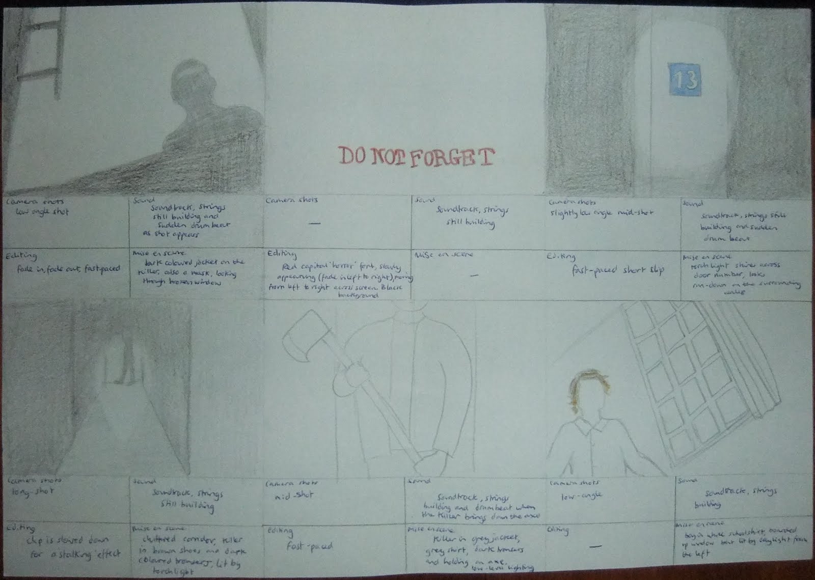
Storyboard
We have drawn out a storyboard after visiting our location to guide us with our camera shots when we next visit to film, we took into consideration our genre research and questionnaire results, as well as our own ideas to create an original plot, for example we have gone against conventions of horror by having only male victims:


Thursday, 4 November 2010
West Park Asylum Shots
After seeing impressive photos of West Park Asylum on http://www.28dayslater.co.uk/forums/tags.php?tag=epsom, an urban exploration website, we decided to visit the location to see if it is an ideal filming location for our teaser trailer. We think so, it is clearly derelict and fits our horror genre for an eerie abandoned location, as you can see from the photos we took:


Tuesday, 19 October 2010
Mise en scene for the boys
Here are some of the costumes characters wear in other typical horror films:
Friday the 13th


 The Strangers

 Tormented


Friday the 13th

My Bloody Valentine
Return to House on Haunted Hill


One factor that links all of this mise en scene is that no clothing stands out, no bright colours are used and no character is dressed out of the ordinary. For example, in Tormented the characters are school students and so are in uniform. This means that we want all of our victims dressed in the same type of 'normal' clothing, no one should stand out. We have decided to dress them all in school uniform; a plain white shirt, blazer, matching colour trousers and plain shoes. This will ensure that no one stands out and show that they are school boys so we do not need to waste time with any other way to show this in our teaser trailer.


Subscribe to:
Comments (Atom)